A lot of the multimedia tools used in this class have been fairly new to me. This is either the first time I have used them, or some of them I have only used once or twice before. With this in mind, when it came time to select a multimedia skill to update and re-work, PowerPoint/Google Slides was an obvious choice for me as I have a lot to choose from, use them often, and I can see the room for improvement in my old catalog of work.
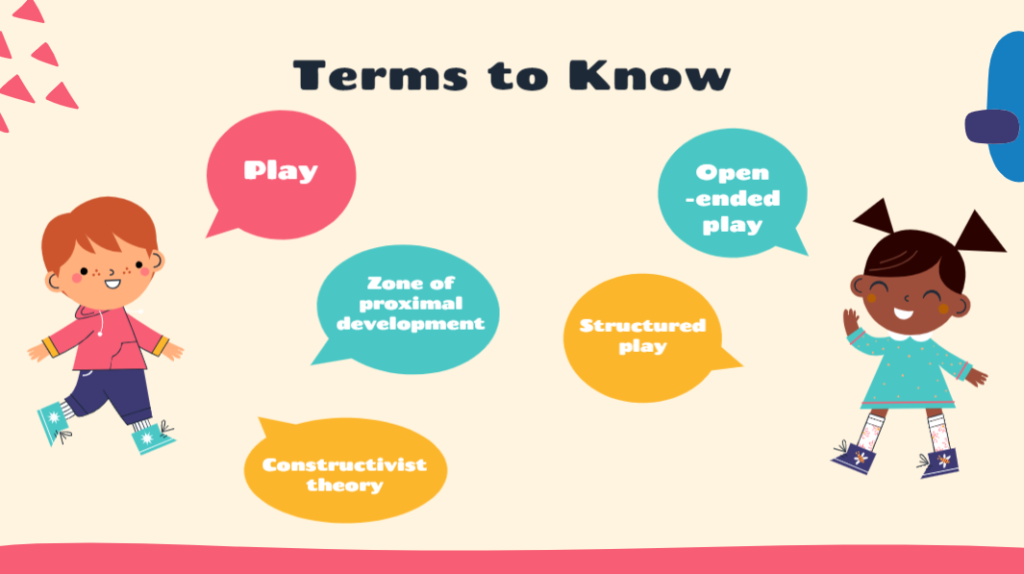
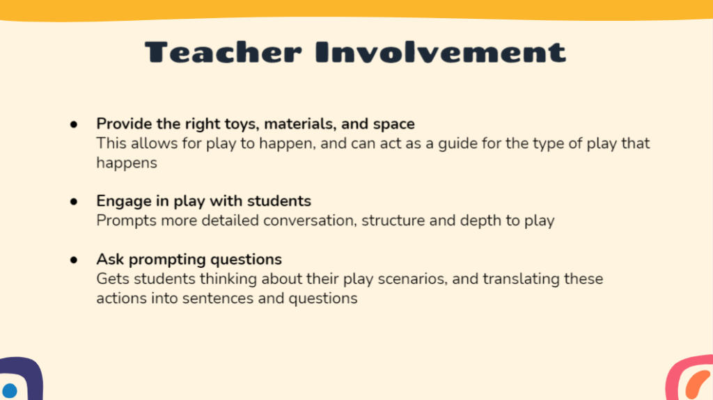
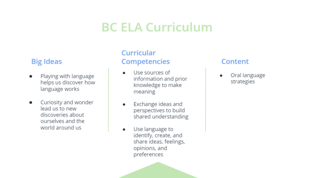
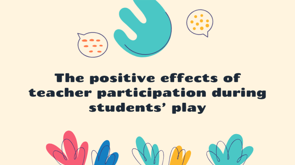
I selected the slides below to re-work. It is a short presentation I made for EDCI 302 about my inquiry topic of open-ended play to support oral language development in the young elementary classroom.
The issues with my original presentation can be boiled down to the following main points:
Colour
The first thing that can probably be noted from this PowerPoint is that I LOVE colour… to a fault. Reading through point #2 from the 6 Dos and Don’ts article, I was able to see that my colours were too haphazard and overpowering.
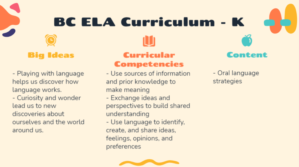
As suggested, I toned them down, still selecting “bright, playful colors” (Miller, 2019) as my topic is positive, but sticking to only two colours to create a consistent scheme.
Busyness
In a couple slides, I was able to identify some writing that did not need to be there. The slide theme itself featured many design elements and shapes that were not relevant to the presentation, so in an attempt to simplify, I parted with those too.
In removing both of these, I was able to pare down what was on the slides, reducing the extraneous cognitive load, leaving room for the audience to absorb more important information. In general, I tried to keep the slides simple and to the point, without appearing too boring.
In keeping with the idea of clarifying and making the slides easier to read, I addressed signaling by highlighting certain words when it felt necessary.
Font
Although not serifed, my original presentation featured a unique custom font for the titles and headings that added to the busyness and made it slightly more difficult to read.
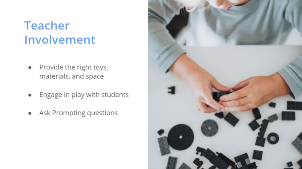
To remedy this, I selected Open Sans; a simple, readable, sans serif font, and used it consistently throughout the entire presentation, again, following the advice of Amanda Miller (2019).
Photos
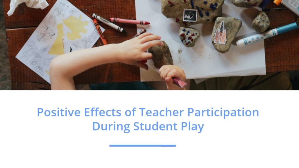
As an additional point, I realized there were no photos to show the concepts rather than just talk about or share them with words, so I added that in as well. I think it not only ties the presentation together a bit better, but helps get the audience into the idea of open-ended play.
All of my original slides tended to break the idea of the coherence principle. There was a lot of unnecessary, unrelated noise that distracted from the presentation. One by one, I worked to eliminate these distractions from my presentation, addressing the problem elements, and put the slides back together.
I wish I could say that being equipped with all of the fabulous information from this class made this seamless and straight forward for me, but old habits die hard. It was really difficult to push myself away from creating what I was used to. I had to focus my thinking at every step of the re-work to make sure that I was actually addressing and fixing the issues, not simply changing them into another issue.
With the new changes made, here is the updated slide deck:
Finally, I tested out the new slides with my original presentation to try out the flow and effectiveness of the new visuals with the information being presented:
References
Cognitive theory of multimedia learning. (2011, July 4). In Wikipedia. http://etec.ctlt.ubc.ca/510wiki/Cognitive_Theory_of_Multimedia_Learning
Li, K. (2018, November 24). How you should actually be using powerpoint. Hackernoon. https://hackernoon.com/powerpoint-doesnt-suck-you-do-8ea0ae5b09a9
Miller, A. (2019, June 13). 6 dos and don’ts for next-level slides, from a TED presentation expert. TED. https://ideas.ted.com/6-dos-and-donts-for-next-level-slides-from-a-ted-presentation-expert/
Shaw, A. (2016, July 14). Cognitive load theory: Structuring learning materials for maximum retention. Wiley Education Services. https://ctl.wiley.com/cognitive-load-theory-structuring-learning-materials-for-maximum-retention/
